
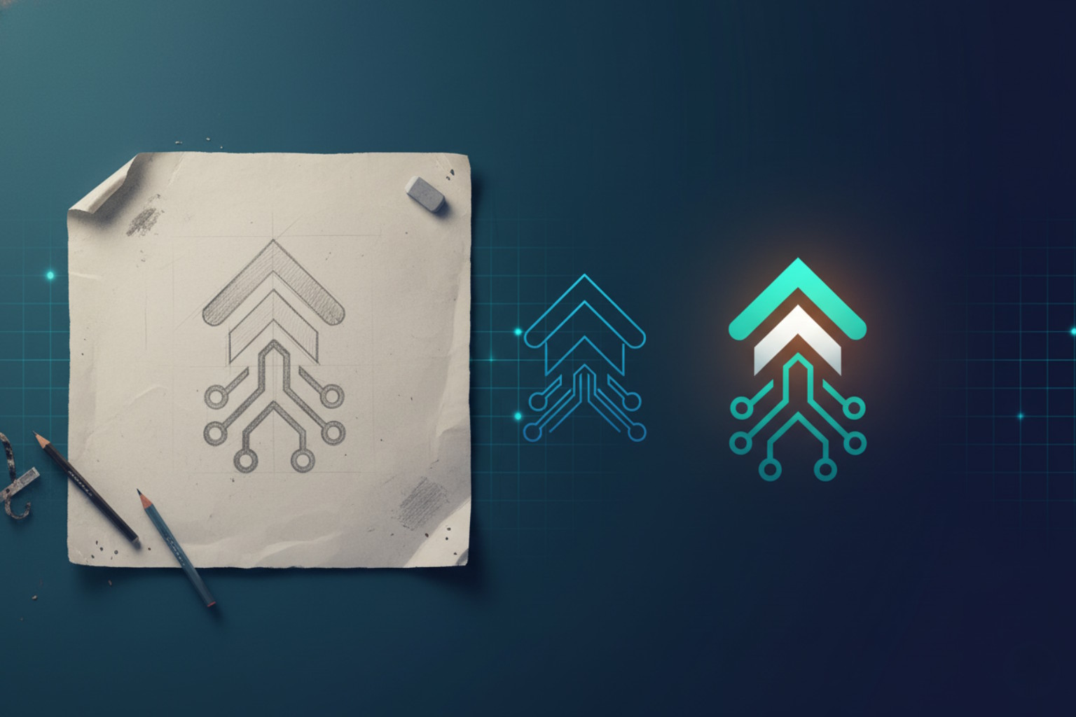
Key Takeaway: Refreshing your logo design is about evolution, not reinvention. The goal is to modernize your brand’s visual identity while preserving the familiar elements that customers already trust and recognize. By refining—not replacing—key design features such as color, typography, and shape, you maintain brand equity and strengthen recognition across today’s digital platforms.
Why “Refresh” Beats Reinvention
Logo design evolves with your business, and sometimes a refresh protects the recognition you have earned. When people think of your brand mark, logotype, wordmark, or visual identity, they remember signals that help them find you fast. Those cues work like landmarks. Change them too much, and customers feel lost. Change them thoughtfully, and your brand looks current while it keeps its memory.
A refresh is not a radical reset. It is a careful update that honors what people already know. Many leaders ask the same question: can we modernize without starting over? The short answer is yes. The long answer is a method that respects history, audience habits, and today’s digital reality.
How Do I Know It’s Time to Refresh?
Start with the friction your audience feels. Do customers mix you up with newer competitors? Do partners struggle to place your badge on slides, apps, or small devices? Do employees feel your mark no longer fits your offerings or tone? When those issues appear, evolution becomes less about taste and more about clarity.
Consider the moments that matter. Think about event screens, mobile app tiles, browser tabs, product dashboards, and social avatars. If your mark blurs, crowds, or shrinks into confusion, the problem is not your reputation. The problem is fit. A refresh aligns the symbol with the places people meet your brand today.
Map Your Visual Equity Before Any Change
Before moving a pixel, map the elements people recognize first. You can call them “equity assets.” Maybe it is an unusual silhouette, a memorable angle, or a distinctive letterform. Sometimes it is spacing or rhythm. Color often carries memory too, but identification rarely relies on one ingredient alone. What matters is the pattern your audience has learned to trust.
Interview front line teams and scan real world uses. Which versions show up in partner decks, trade booths, or screenshots? Which lockups get copied most? The answers reveal where recognition lives. Keep those anchors close as you redraw, refine, or simplify contours. When equity drives decisions, updates feel familiar on day one.
Logo Design Refresh vs. Full Rebrand
A refresh respects the story you already told. It tunes spacing, redraws curves, adjusts proportions, and polishes typography. The voice remains the same, only clearer. A full rebrand changes the cast and the script. It shifts strategy, naming, and the entire identity system.
How do you choose? If your audience still names you with confidence, a refresh likely fits. If your business model, market, or promise has changed at the core, a deeper transformation may help. Treat the choice as a business decision, not a design exercise. The right path depends on how much equity you can preserve without confusion.
Small File Wins: Favicons, Avatars, and Logo Design Shorthand
Tiny canvases test recognition. Think of a browser tab, a watch face, or a thumbnail in a live stream. If customers cannot spot you there, larger spaces cannot rescue you. Create a shorthand that carries the same DNA as your primary mark. A monogram, an initial, or a cropped motif can act as your small space hero. The key is continuity. When users jump from the tiny cue to the full lockup, they should feel the same brand.
Design for Screens Small and Large
Most interactions now start on a screen. Your mark should read cleanly on a phone and then scale across a stage. Aim for consistent proportions across contexts. Protect clear space rules so your symbol can breathe in busy feeds. Consider a motion ready version for video intros or event openers. A short animation can reinforce memory, especially when it repeats across channels.
Consistency does not mean rigidity. You can build a flexible system that supports dark and light modes, photography, and live video. Set constraints that keep the family resemblance while giving teams practical options. That balance helps partners and employees deploy your identity with confidence.
Rollout Like a Narrative, Not a Switch
When you refresh, shape the story before you show the art. Explain the why in human terms: clarity, accessibility, and alignment with where people meet you. Then plan a staged rollout. Update the most visible touchpoints first, such as your site header, event screens, social avatars, and product interfaces. Follow with collateral, signage, and long tail assets.
Use a brief internal playbook. Show approved files, spacing rules, and examples of correct and incorrect use. Equip teams with templates for slides, social posts, and partner placements. When everyone knows the plot, the audience sees one seamless story.
Light Metrics That Matter at the Top of the Funnel
You do not need complex studies to learn whether the refresh is landing. Watch for simple, directional clues. Do support tickets about file formats or legibility drop after the update? Do social polls show faster brand recall in small images? Do event attendees find your booth or session more easily? These signals point to practical gains: less friction, faster recognition, and cleaner collaboration.
Search performance can hint at comprehension, too. If branded search terms strengthen after the announcement, your story connected. If people start spelling your name correctly more often, that is progress you can bank.
Conclusion: Evolve the Mark, Keep the Memory
A smart refresh keeps your brand easy to spot while it feels current in today’s channels. Start with real world friction, map the equity people already know, and build a system that works from thumbnails to stages. Tell a simple story, roll it out with care, and track practical signals that show recognition still holds. If you want to learn more about logo design evolution and how to plan it well, contact us.
